Dear Spurtle
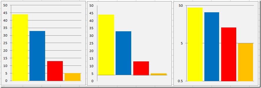
The Conservative bar chart that you featured on 18 May looked to me like the oldest trick in the book, namely an offset zero. But when I plotted it accurately, I found there was more to it than that.
An offset zero will reduce all 3 parties’ apparent share relative to the SNP, including the Conservative share, a fact that you noted previously. Of the graphs below, the one on the left is a straightforward plot of each party’s share. The misleading middle graph plots exactly the same data, but with the zero offset by 4%. It is almost identical to the Conservative printed leaflet, with the exception that the printed leaflet squashes the Labour share down even further by means unknown.
The apparent Labour share of the middle graph could of course be reduced by increasing the zero offset, but this would have the side effect of knocking the LibDems off the graph, which might be suspicious.
If the smaller parties wish to play this game, I recommend the logarithmic scale of the right-hand graph, which proves there is still all to play for.
Ian Green
[See also Breaking news, 29.5.17.]