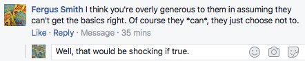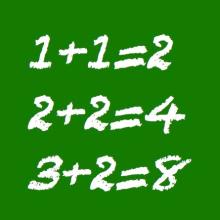
Oh dear. Having pledged we'd take to task all election-connected mangled mathematics that came our way, Spurtle had been hoping we wouldn't have to write anything more on the subject before 8 June.
But no sooner had our first article been published on Monday than a leaflet with yet another dodgy bar chart on it plopped through the letterbox.
An election pledge is an election pledge, so we'll share the offending item with readers here.

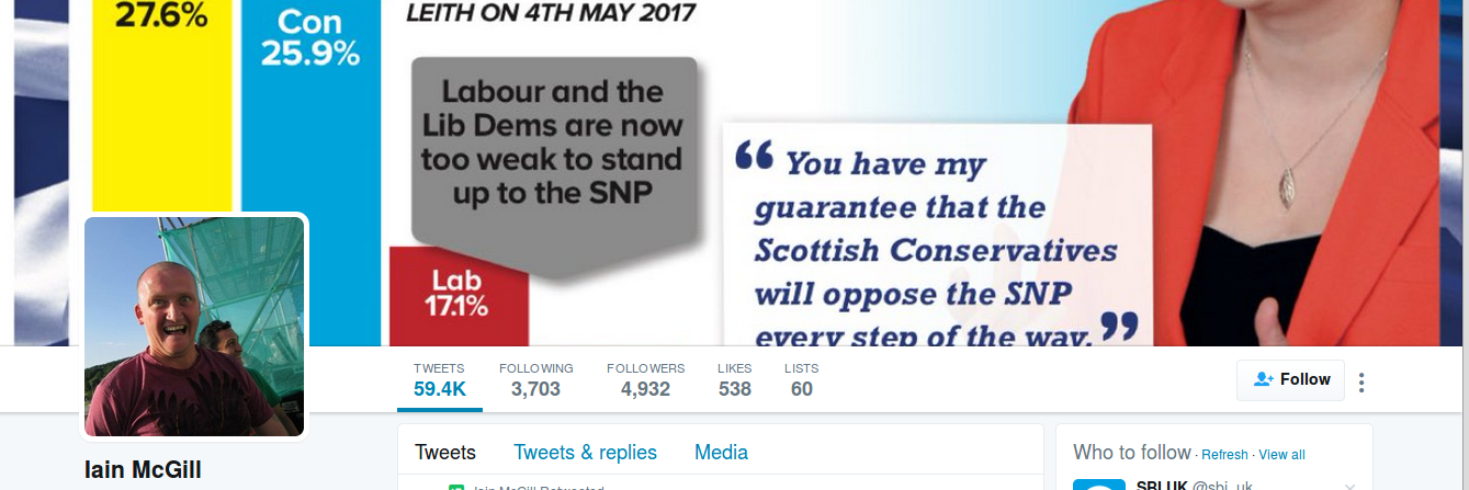
The mangler in the spotlight is once again Conservative candidate Iain McGill, whose bar chart suggests that support for Labour and the LibDems is smaller than shown by his own figures.
We measured the lengths of the columns to be 48mm (SNP), 34mm (Con), 8mm (Lab) and 1mm (LibDem). These lengths are not proportional to the percentages. If the SNP bar were used as the scale, the heights of the bars should have been 48mm (SNP), 36mm (Con), 14.2mm (Lab) and 5.5mm (LibDem).
Thus, the actual LibDem bar is a massive 82% shorter than it should be and the Labour bar is 44% smaller than it should be. In fairness, the Conservative bar is also 5.6% shorter than it should be. Still, the main impression given is that Labour and LibDem support is significantly smaller than it really is.
Is Iain McGill bothered about dodgy bar charts? So far, his Twitter feed suggests not.
This may all seem pedantic, but if politicians can't get the basics right, what about everything else?
If you spot obviously dodgy election bar charts or statistics indisputably gone jungly, no matter which party they come from, we want to know.
Get in touch at spurtle@hotmail.co.uk or @theSpurtle or Facebook
---------------------