NEW ENTRANTS AND THE FINAL TALLY
The election leaflets have been pouring in, and along with them more dodgy bar charts, including a repeat and one with, literally, a new slant on the topic.
First to Labour's Gordon Munro, who, up until now, has had an unblemished record of bar chart scaling.
Sadly, the Labour horse has fallen at the second fence:
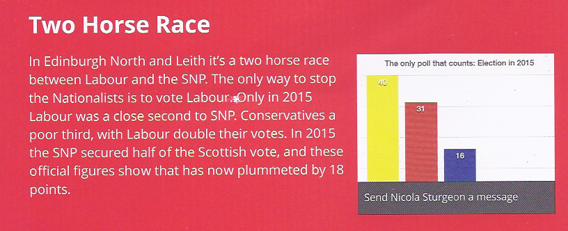
The bottom 7% or so of the the y-axis has been obscured by the box sending Nicola Sturgeon a message, which makes the Conservative bar look shorter relative to the Labour bar than it should be. The Greens and LibDems are completely obscured.
The true proportions of the SNP, Labour and Conservative parties can been seen in this bar chart (below) from Gordon Munro's election communication:
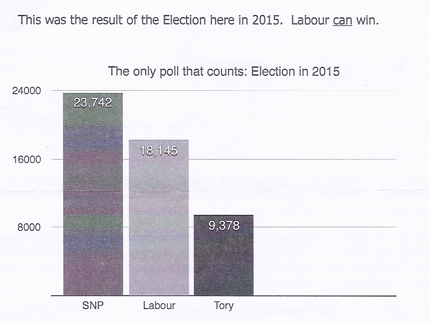
Wot no LibDems or Scottish Greens? Fair enough, their chances of winning are approximately zero, but this was only part of the election results here last time. Spurtle would like to give marks for correct scaling, but this chart does not correspond to the title, so we're calling it dodgy. Previous comments about this poll being 2 years old also apply.
Once more unto the breach
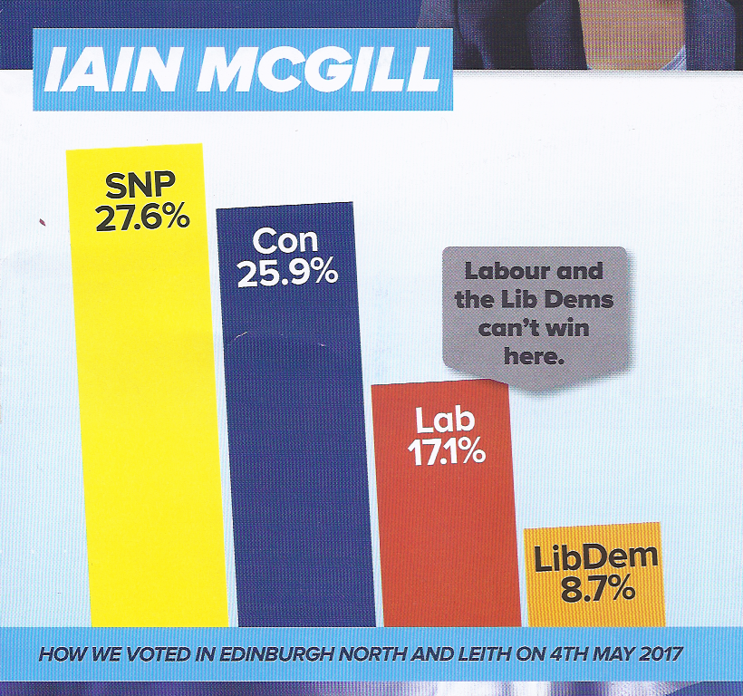
Next, the repeat. Conservative Iain McGill's bar chart of 'How we voted in Edinburgh North and Leith on 4th May 2017' – first seen on the candidate's twitter feed – now appears on his election communication:
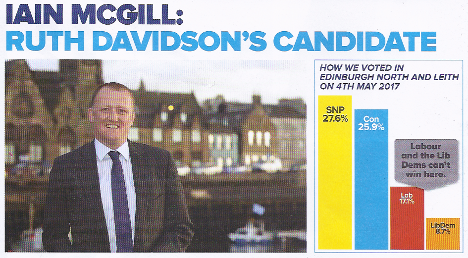
The bars here seem as unproportional as they were in the earlier outing – and hence count as dodgy. It is still not clear how this was calculated, since the Council ward boundaries do not align with the Edinburgh North and Leith constituency.
Bending over backwaards
Finally, a new slant on bar charts – literally:
The proportions of the columns are still not correct, but not so glaringly wrong as in the previous chart.
What really strikes the eye is the slight leftward slant of the bars. What does this Leaning Bar Chart of Pisa mean, beyond demonstrating that the image has been produced by a drawing package rather than a spreadsheet? Is it simply a bored graphic designer having some fun, or is the leftward slant meant to reassure traditional Labour voters who might be considering voting Tory?
It's a two horse race in Edinburgh North and Leith
Including repeats, the final bar chart results are:
- Conservative: 5 dodgy bar charts out of 5 covered in Spurtle
- Labour: 2 dodgy bar charts of 3 covered in Spurtle
- All other parties: zero bar charts.
We emphasise that this is not an exhaustive sample; there may be leaflets and postings on social media that we have missed. However, it does cast light on the inability or unwillingness of some to represent poll statisitics accurately. Draw your own conclusions.
Elsewhere in Edinburgh
Ian Murray, the Labour candidate in Edinburgh South, has complained about the Conservatives using a national poll to suggest that the 'Conservatives can win here'. The bar chart shown in the leaflet in that article has the same leftward slant as the one above.